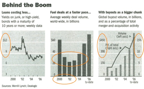
Legends are mostly unnecessary. Instead: get to the data. Look, that’s what they’ve done here for the dollar and percentage signs. And for the scale info.
Source: Wall Street Journal, 2006-11-21, p. C4
Also unnecessary: repetitions. One dollar sign and one percentage sign are enough.
You can reduce skillfully: 2000, 02, 03 etc.
Reference lines really can help sometimes. If they visually increase the relative deviations. That’s what they do in the middle graph.