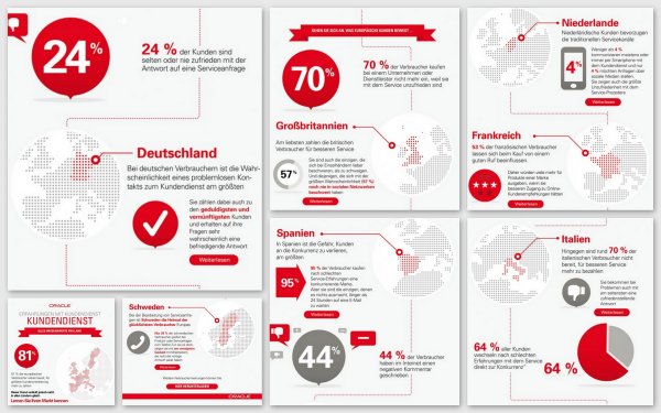
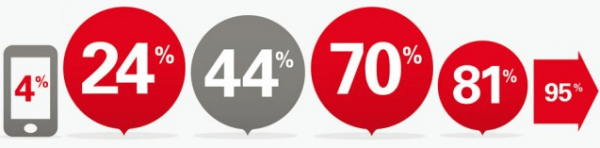
Oracle has painted: How satisfied are people with customer support? Have a look.
Source: Oracle. Found at crmmanager.de. From myself as a collage, from Oracle as stripes.
Click to enlarge.
I am not satisfied. With the graphic.
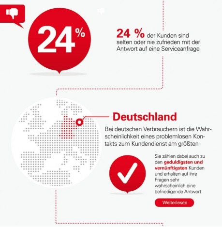
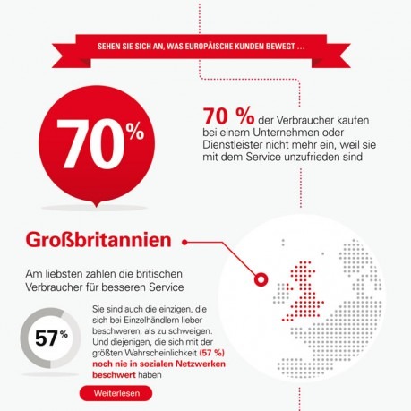
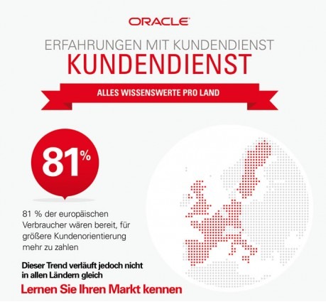
The biggest element is always a number. Just like a headline. A headline tells us the most important point. Doesn’t work here. Because: The number always means something else. And what it means, is written next to it. Very small.
Have a look again.
Source: snipped by myself.
Funny: different percent can have the same size, bigger percent can be smaller than smaller percent.