Again. My law of proportion. The idea of a chart is: Display proportions between values with proportions of length. Proportional. Proportional. Proportional. You can ignore it. You can also lick out an empty bowl. If you are a rather dumb dog.
I yowled on cheating grids for time axis already. They manipulate. This one is even more elaborate. At first glance you think: a nice man, admits he hasn’t got the data. Wrong. He says: “I tease you but I admit it”. Remove 2001. It suggests that 2002, 2003, 2004, 2005 have been the same as 2001. Were they, really?
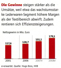
Source: Euro 06/07, p. 42.
This is Howard’s rule „Ignore the visual metaphor altogether” in action. The data doesn’t fit on paper but I show it. A graph doesn’t fit on your paper? Use a table.
Source: Wirtschaftswoche 27, 2008-06-30, p. 82.
I like „Die Süddeutsche“. Its the first newspaper with graphic tables in the stock market section. And now this. The most interesting information – the outliers, the hotshots and the losers, that what you need to know: hidden. I’ll be on vacation.
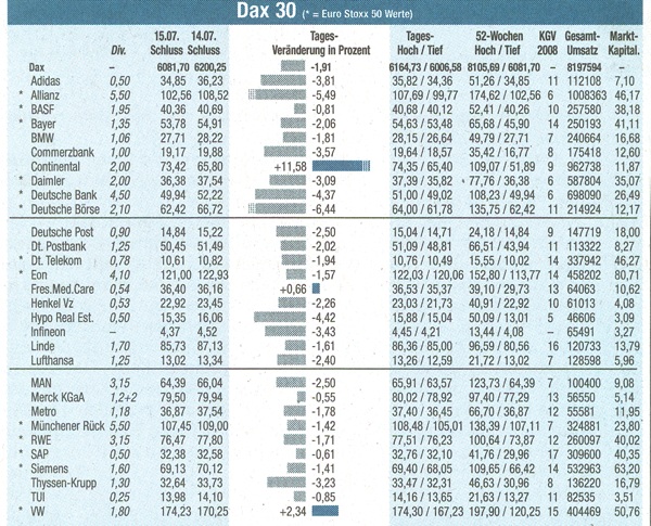
Süddeutsche Zeitung, 2008-07-16.