Visualization often focuses on changes in shares which are compared to a total. Stacked column graphs which add up to 100% are a common chart type. But not for more than three shares at once. Readability is becoming too bad. Even three cause problems.
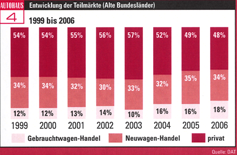
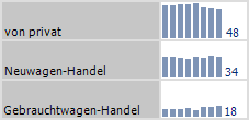
Shares of channels for selling used cars: used car dealers, new car dealers and private
My eye has to grasp the height of the top-most columns from the top down. The columns in the middle are even worse. My eye keeps jumping up and down to grasp their height. The source of the problem: the top line symbolizes 100%. This is also plain to any reader, if I tell him beforehand that everything adds up to 100%. Thus, no need to focus the design of the graph on this convention.
Option 1: Columns in a Graphic Table
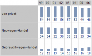
Option 2: Sparklines in a Graphic Table